16×16 Pixel Art Tutorial
Apparently pixel art is cool once again, and if you are reading this blog, chances are, you like pixel art. As my first actual article on the site, I thought I’d make a little tutorial on how to pixel your own 16*16 sprite, that you can use as a favicon for your website or game. There are many ways to go about pushing pixels, and this is just one of them. Sadly, this tutorial will not teach you how to draw or come up with nice ideas, sorry. Also I will not go into program-specific details, you need to have some basic familiarity with the software you want to use.
Fire up your app of choice (mine is GraFX2, but you may be more comfortable with Photoshop, GIMP or what-have-you), and make a new 16*16 pixel document. Done? OK, now take my hand and I’ll walk you through the steps of pixeling a frog.
Step 1 – OUTLINES

What to do:
Using black colour, make a little drawing inside the bounds. Now, 16×16 pixels can seem like a very small space, and it is, but it will teach you the first lesson of pixel art, to make each pixel count.
Important:
Make sure your drawing is fully articulated and readable at this stage. If you start with a bad drawing, no amount of polish will be able to save you.
Step 2 – BASE COLOURS
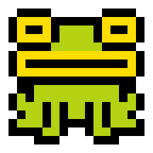
What to do:
Colour inside your drawing, just set the basic colours and avoid any shading
Important:
Make sure your base colors work well together and are also bright and vivid enough, at this stage the drawing should be even more readable than the last stage, not less.
Step 3 – SHADOWS
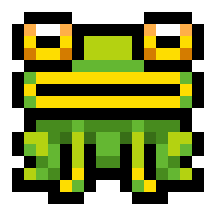
What to do:
For each of the base colours from the previous step, make one darker color and use it to add shadows where needed. For simplicity’s sake, imagine your light is coming directly from above.
Important:
Always review what you’ve done. Don’t be afraid to change your base colours if, after adding shadows, you find them too dark.
Step 4 – OUTLINE COLOUR
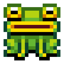
What to do:
Add some colour to your black outlines. Add as many new colours as you need. Generally, you’ll want your outline colours to be a darker version of the fill colour.
Important:
One neat trick is to use outline colour to imply shading as well. Observe the outlines of the frog’s eyes, notice how upper parts are fairly bright, while lower lines are black.
Step 5 – ENJOY (and potentially boast)
Hopefully your little sprite will end up looking like a tiny toy. If it looks terrible try to figure out where you went wrong. Perhaps you were too ambitious and wanted to put too much detail into such small space? Keep in mind that it is always good to simplify the shapes and focus on giving them volume. Perhaps you are just hopeless and the more you work on it, the worse it looks? In that case there is only one thing to do: take a break and feast your eyes on some good pixel art until you regain your vigor. Once you have tackled the challenges of pixeling, you will be able to better analyze other people’s work and identify what makes it good. Conveniently enough, here are some more sprites (one of which is the new favicon for this site) all made using the delicious recipe described above.
Happy artings and see you soon!
i
Posted on September 27th 2011 at 11:16 pm by iLKke.
View more posts in Tutorials. Follow responses via the RSS 2.0 feed.
74 Responses
Leave a commentMake yourself heard
Hire Us
All about Photon Storm and our
HTML5 game development services
Recent Posts
OurGames
Filter our Content
- ActionScript3
- Art
- Cool Links
- Demoscene
- Flash Game Dev Tips
- Game Development
- Gaming
- Geek Shopping
- HTML5
- In the Media
- Phaser
- Phaser 3
- Projects
Brain Food



This is exactly what I need right now. Thanks for all that you do.
This is so useful, thanks!
Thanks!
Thanks alot, that’s really cool. Wish to see more beginner tutorials, I always appreciated your work.
-test84
very cool ! but I dont know where to draw the shadow. is there some formulas ?
Nice one – thanks
great one! Got any hints about making seamless tiles btw? (Besides keeping the making a one colored border).
can I use the parrot and the duck in my web?
Helpful! Thanks a lot!
Great lesson, thank you! It would be great to see the lesson about the animation of sprites!
Haha, I love the owl and the fish icon you made!
Very good tutorial!
Thanks so much for this! I LOVE pixel art and I’m pretty artistic using non-digital mediums (painting, sketching, etc), so I’ve always wanted to try doing some pixel art. This is a great little tutorial you’ve got, very simple and approachable.
Thank you for your tutorial, it is quite helpful because you have explained the basics of drawing in 16×16 pixels clearly. Maybe you would be willing to make one on drawing and animating characters in the same format too?
helpful thanks! nice sprites too !
Thanks, but now tell me how to do shadows and outline color using only 16 colors.
You really help me guys!!!
Thank you!
Awesome tut

i wich you made more
For shadows, more than one shade is used in the example. Also, highlights are used in the eyes. The tutorial is good, and simple, but not that simple. Take a close look and see that the artists work is beyond that of their advice.
Bumping this to people who are doing #PixelChallengeOfTheDay to read.
We do 20×20 images (for now anyway, heh), so this is still pretty applicable to them.
Wow thanks this is great I have been trying to create an original favicon for my website and this helps a lot. Thanks!
Always glad to see people talk more about pixel art. In this era of 3D gaming pixeling is becoming a lost art. We have to keep it alive. Thanks for passing on the knowledge!
Since you enjoy working with GraFX2, you may wish to check out Moai as well. It’s a pixel editor designed to imitate many of the features of Autodesk Animator.
The yellow fish in the glass bowl is very cute. Yellow fishes are the best!
very, very cool!
For a b&w 16×16 editor, try: http://pxlshp.com
works on smartphones and tablets, android/ios and desktop!
(disclosure, i made it)
also: http://unterbahn.com/search/pxlshp
Congrats Photon!
This post was included in the “Code Project Daily News” email today.
You lost me on step 3. The technique used to draw the shadows on the lower half of the frog is completely obfuscated to me.
Maybe it is just me that have very bad drawing skills.
Great post. I get how to do the outlines and coloring (steps 1 & 2) but the shades, I could never do. A tutorial on shading would be great.
Awesome! I had so much fun with this
I made a tiny pig: http://i42.tinypic.com/2qlyjc3.png
I made a little tool you can use to draw tiny pixel art pieces of 16×16 pixels, you can try it at http://drawbang.com, feedbacks are welcome!
Awesome Tutorial, love it!
Thank you a lot for this, mate!
nice it really helps
Would you mind linking a Grafx2 download page? On their ‘new’ website there are no clickable links
Thanks for this! I’ve been wondering how to create pixel art, but I thought for sure it couldn’t be as simple as using such a small pixel document. Guess I was wrong! Would love to see a tutorial on scaling.
Oh yeah! I agree with the idea that there is a coincidence.
THX this helped me tonnes!